iPhone Do-over
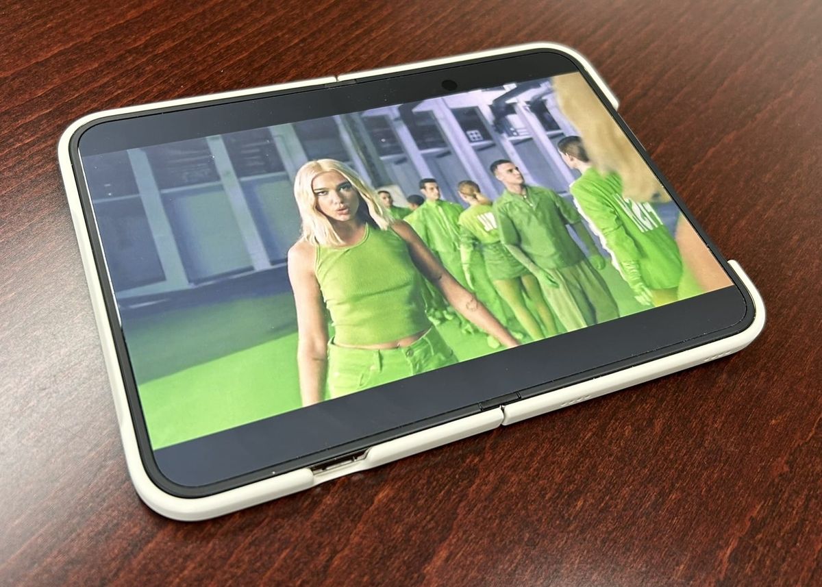
Apple’s long-awaited entry into the foldable phone market is here, and for the past ten days I have been using, puzzling over, and enjoying it immensely. It’s charming, innovative, useful, confusing, and very, very expensive. Folded up, it’s a weird little guy of a phone; unfolded, it’s a damn good mini-tablet. But what interests me most about it is what it isn’t: iPhone Duo is a Duo because it is two products in one, but it’s an iPhone because neither of those products is an iPad.
iPhone Duo is the biggest change to iOS since iPhone X, if not since the first iPhone in 2007. Folded, it’s more square than any previous iPhone—“passport” shaped—and to accommodate, the iPhone Duo breaks with many iPhone design conventions. The status bar from the top of the screen, the dock from the bottom of the Home Screen, and toolbars from wherever toolbars live have all migrated to a new sidebar on the right of the outer screen. This creates a few UI oddities, such as “back” buttons appearing at the right edge rather than the left, and controls getting squished and hidden because of the Dynamic Island above and keyboard below. I mostly find myself acclimating well to the change, although people accustomed to one-handing iPhones in their left hand may find it challenging.
But what makes the Duo the Duo is the fact that it opens up to reveal a larger display. Here, Apple has added a bit of high-tech whimsy: while opening the phone, the image on the outer screen recedes and blurs starting from the edge, and the inner screen lights before the phone is fully open. The effect suggests that you are looking through a transparent surface at the inner screen. This is an illusion, of course, and it breaks outright in situations where one screen is rotation-locked in a way that contradicts the other. The whole production seems like a second pass at the “spooky eyes” effect Apple implemented on the outer screen of the Vision Pro, which shows onlookers a projected view of the wearer’s face. As on the headset, the effect is imperfect, but the Duo pulls it off better (perhaps because there is no living person to send to the Uncanny Valley).
That inner screen, once revealed, is quite nice. Yes, like other foldables, there is a distinct crease where the screen folds. I can always feel it. I can often see it. I sometimes think about it. I’ve never been bothered by it. Apple has done as good a job as any at minimizing the crease. One element of their strategy to do so is a nano-textured display layer, a first for an iPhone. This gives the Duo a matte appearance that is somewhat resistant to glare. It also gives the inner screen a great paper-esque feel for writing or drawing with Apple Pencil (iPhone Duo's Pencil support being another first for the iPhone line). The matte finish does take back some of the contrast from the OLED screen, but I have found it very pleasant to read, scribble, watch videos, game, and just generally compute on—basically, to do almost everything I do with my iPad.
For all of that, though, it’s important to remember that the inside screen is NOT an iPad. It’s smaller than the iPad mini. iPadOS’s windowed multitasking, the menu bar, Slide Over—none of these made the jump to the Duo. iPhone apps that have an iPad version still run on the Duo as if it was an iPhone, because it is one.
The conventional wisdom in tablet computing is that Apple’s iPad ecosystem is more mature and fit-to-purpose than Google’s Android; iOS apps adapt or have bespoke iPad versions that take great advantage of the large screen. But on the Duo, Apple has abandoned iPad layouts, and the layouts of unoptimized apps are not responsive to the larger screen size. Older, non-Duo-aware builds of apps float in the middle of a sea of black, straddling the crease. When oriented in alignment with the phone screen, apps can be expanded to better fill the screen, though they remain letterboxed or pillarboxed by black. They don’t automatically switch between portrait and landscape as the phone turns, but must be manually rotated with an on-screen control (a touch so un-Apple-like, in fact, that I spent the first 72 hours assuming unoptimized apps couldn’t change orientation at all).
Why would Apple throw out years of tablet dominance, of experience at making great iPad apps, for the launch of the tablet-style variant of its most important product? I believe it is because while the Duo is two devices in one—the outer face is a smartphone, and the inner one undoubtedly a tablet—Apple also eschews the notion of the “toaster fridge” and is at pains to present a unified, singular experience. In contrast to other foldables, Apple chose to give the outer and inner screens of the Duo the same aspect ratio, and they create that delightful but completely unnecessary illusion of two different views of the same display when folding and unfolding. I say iPhone Duo is a phone that turns into a tablet; I think Apple would say iPhone Duo is an iPhone that turns into a bigger iPhone.
And to be fair to Apple, some of what was lost from iPadOS is, if anything, an improvement for the Duo. iPad multitasking, which now includes windowed apps and the red-yellow-green stoplight controls of the Mac, wouldn’t fit as well on iPhone Duo’s 7.6-inch inner screen. In landscape orientation, Duo does support multitasking, though, allowing two apps to be snapped side-by-side. In that mode, either half of the screen can show a running app or its own view of the Home Screen, an experience I find (ironically) evocative of Microsoft’s split-screen Surface Duo phone. iPad multitasking is more powerful, surely, but it’s also convoluted enough that I’m not going to try to describe it here to contrast with the Duo. Suffice it to say iPhone Duo’s version is more intuitive, and being able to multitask at all on the iPhone is a huge gain.
You can open iPhone Duo any time and anywhere if you need a larger screen (or two apps), and I do so throughout the day, but I find I tend to settle into one mode or the other—either making do doing “phone things” on the outer screen, or opening it up deliberately for a while to do “tablet things.” The size and weight both feel perfect when open, reminding me very much of an e-reader or one of the Android mini tablets I’ve used from time to time. Unsurprisingly, all of my iPad-style reading has been taken over by the Duo; it is perfectly sized for bedtime reading and the anti-glare nano-texture is easy on the eyes during the day. I prefer the size and stability of the iPad for handwriting, but taking notes on the Duo is excellent (though the small size plus camera bump make it rock too much when laid flat on a table).
Do I recommend iPhone Duo? I love it, personally. But it is wide and awkward when closed, not a full iPad when opened, and many apps are still not optimized for it. It is very expensive (starting at nearly $2000 US), and being a brand new product, its durability and reliability are unproven. It is simultaneously the best tablet and also the weirdest iPhone I’ve ever used. I think my strongest two recommendations would be, first, don’t buy it if you are on the fence, particularly if you can’t get to an Apple Store to put your hands on one. And second, it may take the place of an iPad, but don’t buy if you are specifically an iPad power user looking to consolidate devices—it can do many of the same jobs, but it does not recreate the feature set or experience of an iPad.
One critique about the original iPad was that it was “just a big iPhone.” And for better or worse, it was. But as the platforms have grown and matured, that’s less true today than it ever has been. In the Duo, Apple has released its first new, non-iPad tablet since the iPad itself. And just like the last time they introduced a new tablet, it is, in fact, just a big iPhone.